Dashboards nobody opens
Reports exist, but leadership still asks for numbers by email every Monday.

Solutions — Data & Operations
Most dashboards are built once, admired twice, and never opened again. We build reporting around the decisions leadership makes — and the habit of using it.
Reporting and dashboards done well start from the decisions they serve: what leadership needs to know weekly, what managers need daily, and what definitions everyone must agree on before any chart is drawn. We build this across Zendesk and HubSpot — the metric definitions, the data hygiene they depend on, the dashboards themselves, and the scheduled delivery that turns reporting into a habit instead of an artifact.
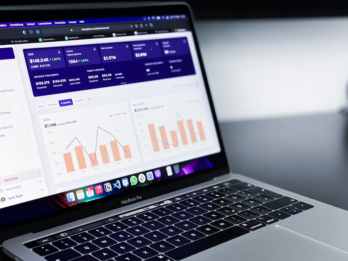
Reports exist, but leadership still asks for numbers by email every Monday.
Two dashboards show two different revenue figures, so people trust neither.
A wall of graphs that answers no actual question anyone is asking.
We ask what choices each audience makes, then work backward to the handful of numbers those choices need.
✓Checkpoint — scope mapped & success criteria agreedWhat counts as an MQL, a resolved ticket, a won deal — written down, so two dashboards can never disagree.
✓Checkpoint — design reviewed & signed off with your teamReports are only as good as the fields beneath them; we repair the data hygiene the metrics depend on.
✓Checkpoint — built & tested against real scenariosDashboards per audience, plus scheduled digests to inboxes — because reporting nobody sees might as well not exist.
⚑Milestone — live, verified & documentedThe numbers leadership actually reads, month over month — with a filled example row and space for the narrative.
It answers the questions its audience actually decides on — a handful of metrics with agreed definitions, trends over time, and no vanity filler. If a chart does not inform a decision, it does not belong on the dashboard.
Usually because metrics disagree between reports, the underlying data is not trusted, or the dashboard was built around available data instead of real questions. Fixing definitions and hygiene first is what makes reporting stick.
Yes. With the two platforms integrated and definitions aligned, support and revenue data can appear in unified reporting — including how support experience relates to renewals and expansion.
One audience per dashboard, five to nine metrics that actually drive decisions, and definitions everyone agrees on — revenue and resolution numbers first, activity counts last. If a metric never changes a decision, it's decoration.
Related: all our solutions · All solutions · Talk to us
Data strategy, cleansing, and systems built by an accountable team.
Contact us